
These 7 ideas range from quiet cream to bold navy, and the right one depends less on taste than on what your roof and any fixed stone or brick already demand.
I would hold a sample board against those unchangeable elements at mid-morning and late afternoon, since the same sage or warm yellow shifts warm or cool as the light does.
2 coats over primer, minimum, for the navy that risks looking like a void without white trim and brick warmth at ground level.
1. Sage Green

Sage green reads as neutral from the street but still has enough pigment to feel chosen, not defaulted. White trim keeps sage crisp; without that contrast, sage can go muddy on shaded lots.
I would check my roof color against a sample board before committing, since sage leans warm or cool depending on the light and the shingle tone will tip it one way or the other.
Wood doors suit it; painted doors fight it.

Ready to use, pre-mixed door and trim paint offers a fresh new look on interior or exterior metal, wood and fiberglass

PREMIUM ENAMEL FINISH: Delivers a durable gloss spray paint finish that resists chipping and fading for long-lasting color on interior and exterior surfaces.

CONVENIENT SIZE - FolkArt Outdoor Acrylic Paint comes in convenient 2 oz bottles of outdoor craft paint - perfect for painting flower pots, birdhouses, mailboxes, patio décor, and so much more
2. Warm Yellow
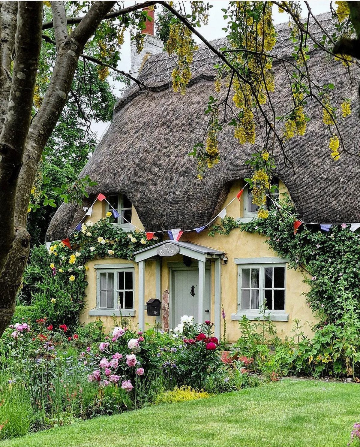
Thatched roofs and warm yellow belong together the way clapboard and grey do, but the pairing still needs discipline.
The green trim here is doing the work; yellow without a second color turns taxi-cab fast. I would plan the trim first, then test the yellow against it in morning and evening light, since this shade shifts dramatically.
Flower gardens help, yet they are not a fix for a tone that reads too bright; get the wall right, then plant.

Ready to use, pre-mixed door and trim paint offers a fresh new look on interior or exterior metal, wood and fiberglass

Ready to use, pre-mixed door and trim paint offers a fresh new look on interior or exterior metal, wood and fiberglass

3. Navy Blue

Navy on a cottage risks looking like a yacht club or a void, and white trim is what saves it from either.
The brick porch helps too; without some warmth at ground level, navy can feel top-heavy on a small footprint.
I would budget for quality paint here, since dark colors show chalking and brush marks sooner than mid-tones. 2 coats over primer, minimum, and I would not attempt this over bare wood in a single weekend.
ELEVATE OUTDOOR STRUCTURES: Refresh barns, fences, sheds, and exterior surfaces with durable paint that delivers long-lasting color and protection.

TRUE ALL-IN-ONE PAINT & PRIMER – Skip the extra steps. Evolve Tru Coat combines paint and primer in one, delivering excellent adhesion and coverage on wood, metal, masonry, and concrete with minimal prep.

ALL-IN-1 PAINT & PRIMER: A hardy multi-purpose and multi-surface one-coat paint and primer in one for almost any indoor or outdoor surface. A wall, ceiling, floor, skirting board, cabinet, furniture and door paint for your bathroom, kitchen, home and garden.
4. Aqua
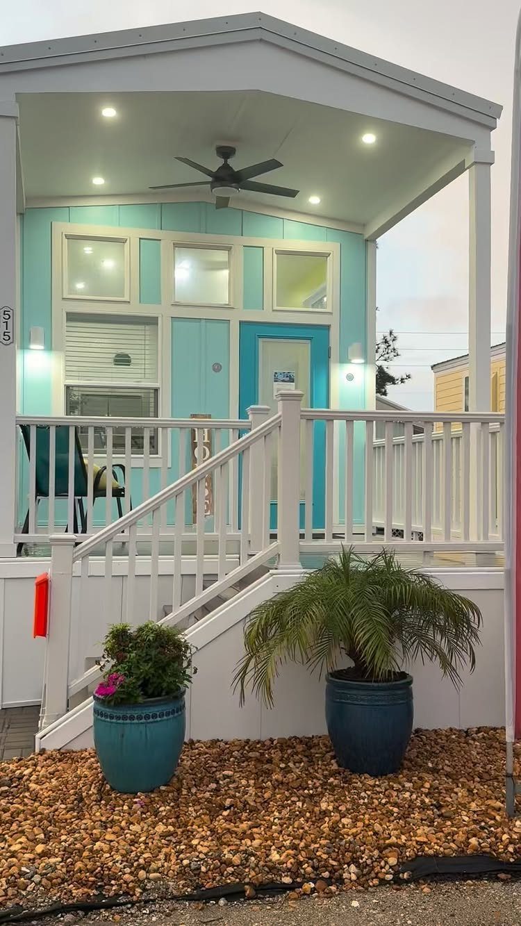
Aqua sits between blue and green in a way that pleases from a distance but can tire up close, so I would use it where the approach is longer than the porch is deep.
White railings give the eye a place to rest; aqua on railings with aqua walls would feel like a pool.
I like the separate blue door here, it adds a layer without clutter. Porch pots in terracotta, not more blue, keep the palette grounded.

White Exterior Wood Paint for Outdoor Surfaces Refresh and protect decks, fences, railings, pergolas and outdoor furniture with a durable water-based exterior paint that provides long-lasting white coverage while helping resist peeling, cracking and fading.

Flows on smoothly and dries to a tough, durable finish

This high-quality, acrylic latex water-base interior/exterior paint offers excellent hiding properties with great adhesion and water repellency on textured interior and exterior surfaces
5. White
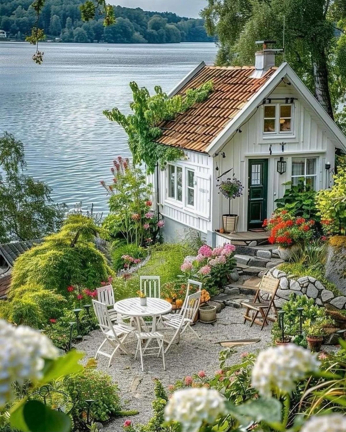
White cottages look effortless in photos and demand the most maintenance in reality. The dark green door in this lakeside example is the detail I would copy; without one strong accent, white reads as unfinished or rental.
Tile roofs age more gracefully with white than shingles do, since algae and streaking show inside a season on asphalt. I would power wash annually and plan to touch up trim more often if the weather turns harsh.

Suitable for interior/exterior metal or wood surfaces such as doors and shutters

ALL SEASON PAINT & PRIMER-IN-ONE: Cascadia XL is a 100% Acrylic Latex Paint & Primer-in-One with advanced technology for rain protection and a superior finish

Includes 30 featured and newest released color card. Sprayed on color to see our colors in your homes lighting for more accurate color choices.
6. Charcoal Grey Exterior

Charcoal grey on siding is a modern move that still reads cottage when the scale stays small and the trim stays white.
The pink door here is the risk that pays off; I would not default to red or black just because they are safe.
Brick walkways suit this palette better than concrete or gravel, since grey needs warmth somewhere and the path is cheaper to source than a wood door.
I would check the grey in overcast light, where it can go flat and institutional.
ALL-IN-1 PAINT & PRIMER: A hardy multi-purpose and multi-surface one-coat paint and primer in one for almost any indoor or outdoor surface. A wall, ceiling, floor, skirting board, cabinet, furniture and door paint for your bathroom, kitchen, home and garden.

Revolutionary spray paint technology that provides exceptional coverage

ALL-IN-ONE PAINT KIT - CIONIA all match paint kit includes essential painting tools and combines paint + primer in one water-based formula, helping you complete DIY furniture and home painting projects faster and easier with minimal preparation.
7. Cream Exterior

Cream softens a cottage without going full pastel; it reads as color to the eye but stays quiet enough for gardens to do the talking.
White trim here is doing more than framing, it is keeping cream from reading as dirty beige in shadow. I would test against the stone walkway before buying, since cream picks up whatever warmth or coolness sits nearby.
The dark door adds the weight this palette needs; without it, cream and white together can float away. Wicker on the porch suits this tone better than painted metal; the texture matters when the colors stay this restrained.


Choosing the Right Color Scheme
Look at the houses on your street before you open a paint sample. What works 3 doors down probably works on your lot too, since the light and the tree line are shared.
Florida coastal cottages carry an Art Deco history that suits bolder palettes; a New England Cape Cod reads right in gray, white, and dark slate trim.
Your roof and any stone or brick that stays put matter more than the siding you change.
I would hold a sample board against those fixed elements at mid-morning and late afternoon, when the sun shifts warm or cool and the color with it.
Historical palettes are not a restriction; they are a tested starting point that keeps the house looking like it belongs.

Includes 30 featured and newest released color card. Sprayed on color to see our colors in your homes lighting for more accurate color choices.

Ready to use, pre-mixed door and trim paint offers a fresh new look on interior or exterior metal, wood and fiberglass

Extremely durable outdoor paint ideal for use on properly prepared exterior wood, brick, masonry, concrete, weathered aluminum, weathered vinyl siding*, and primed metal substrates
Using Multiple Colors
A cottage exterior needs three colors minimum to hold together: one for the walls, one for trim, and one that does the actual work of making the place memorable.
The wall color is the largest area and the one you will tire of fastest if it shouts.
White or off-white trim breaks up the field color and gives the eye a clear stopping point; it also draws the actual edges of windows and doors so they read as shapes instead of holes in the wall.
The accent is where I would spend my courage, since it is the smallest area and the easiest to repaint.
A door in pink, dark green, or separate blue from the wall adds the layer that keeps a cottage from reading as a model home.
I would choose the accent last, after the wall and trim are settled, and test it from the street rather than up close.
Two colors risk looking like a base coat waiting for the finish; four can work, but only when the palette is already restrained.

【Everything You Need】Our comprehensive wood paint kit comes with all the essential tools to revitalize your furniture paint projects with ease.

PAINT & PRIMER IN ONE – White satin acrylic paint combines paint and primer in one formula, delivering strong adhesion, smooth finish and easy application while reducing project time.

Ultra Premium Paint and Primer In One