I would hold chips against those fixed finishes in direct sun before deciding, because 2 colors can look perfect on paper and still clash once they are on the house.
1. Charcoal and Black Shades

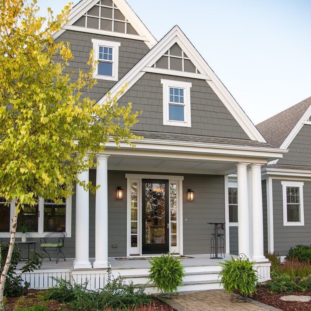
Charcoal and black shades read as architecture rather than paint, which is why they work on traditional shapes that might look theatrical in true black.
Wood shutters and a wood door keep charcoal from reading too flat; without that warmth, the house can look like a sealed box. I would check the light your facade gets before committing.
North-facing charcoal can turn muddy by late afternoon, and you will need that wood accent or a brass fixture somewhere to break it up. Budget for a second accent color even if you think you will not use one.


Extremely durable outdoor paint ideal for use on properly prepared exterior wood, brick, masonry, concrete, weathered aluminum, weathered vinyl siding*, and primed metal substrates
2. Pewter
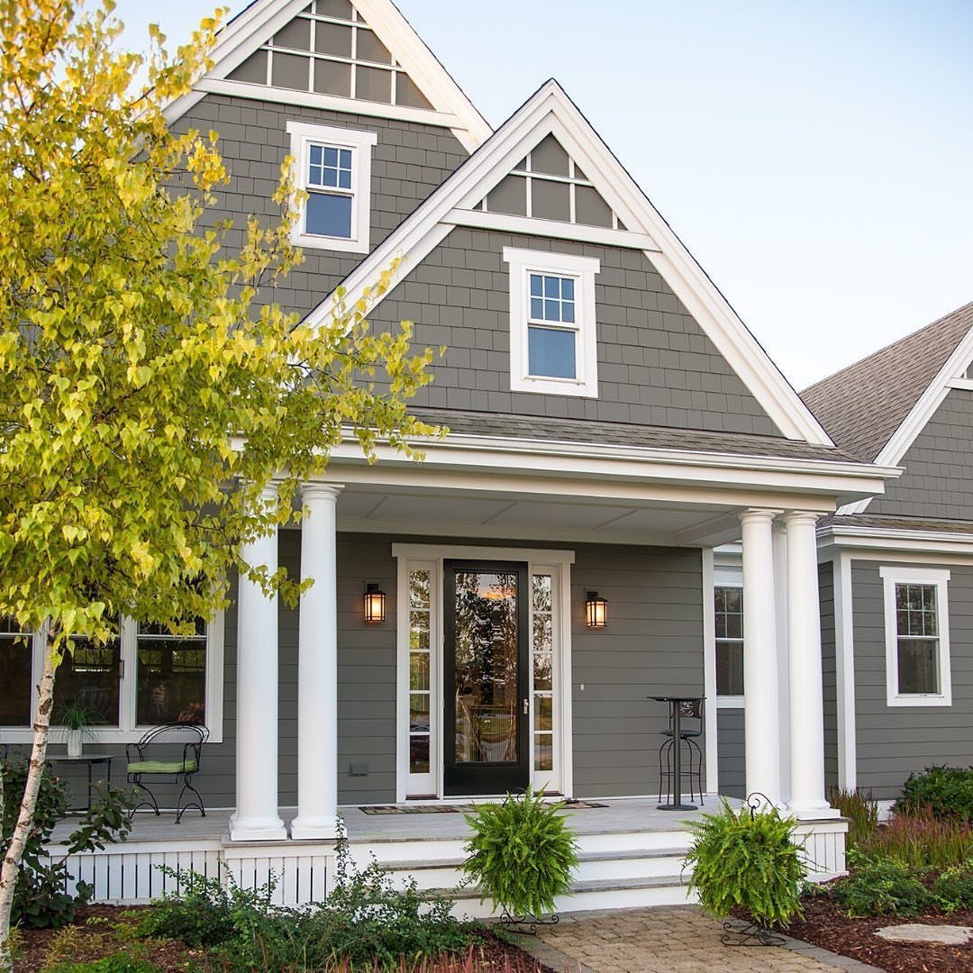
Revere Pewter by Benjamin Moore sits in the gray family without the coldness that sends some homeowners toward beige instead.
This is why pewter suits porches and columns: the color shifts with the sky rather than fighting it, and white trim stays crisp against it without looking stark.
I would sample it on the wall that gets the most sun, because this shade can pick up green from surrounding trees and read warmer than the chip suggests.
It is forgiving enough that you could carry it from siding to foundation without a second color, though white columns give it more structure.

Ideal for use on interior/exterior surfaces including wood, plastic, plaster, metal, masonry and unglazed ceramic Oil-based formula resists chips and provides long-lasting...
3. Dovetail by Sherwin Williams
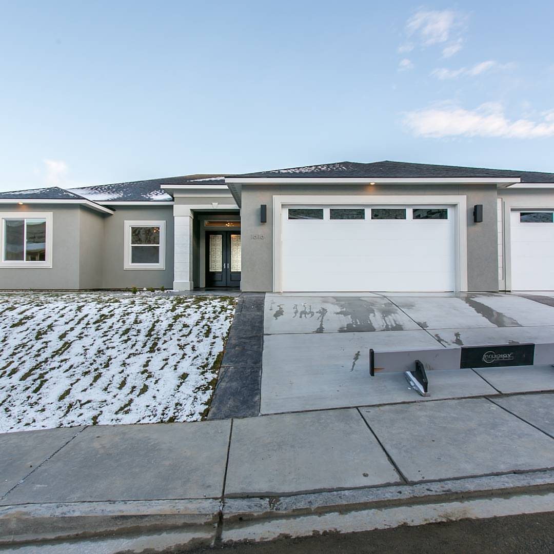
Dovetail by Sherwin-Williams lands in that narrow space between light gray and greige, and it handles a modern facade without looking like a color choice you defaulted to.
The white garage doors and trim give it the contrast it needs; without that separation, the whole house can go flat. I would plan the trim first, because Dovetail changes depending on what sits next to it.
Against warm white it pulls taupe, against cool white it reads stony. Sample both directions on the same wall and look at them in morning and evening light before you buy the full batch.

Extremely durable outdoor paint ideal for use on properly prepared exterior wood, brick, masonry, concrete, weathered aluminum, weathered vinyl siding, and primed metal substrates

Made in United States

Ready to use, pre-mixed door and trim paint offers a fresh new look on interior or exterior metal, wood and fiberglass
4. Dark and Dramatic Hues
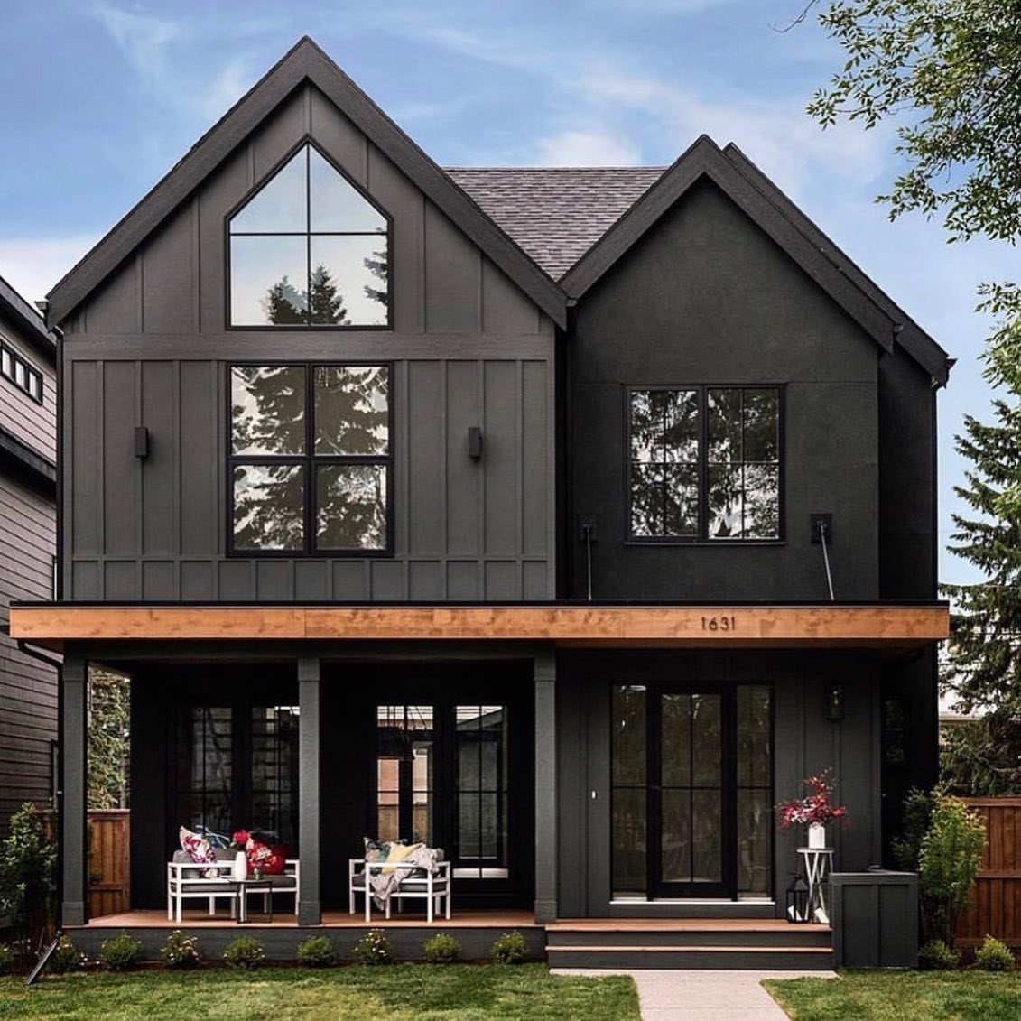
Dark and dramatic does not have to mean black; charcoal is soft enough that wood trim and the house number still register from the street.
The large windows help, because dark siding eats light and can make a house look smaller than it is.
I would use this on a facade with some depth, gables or a covered porch, so the shadows do not turn the whole thing into a single mass.
Chairs on the porch matter more than decoration; they signal that someone lives there, which dark exteriors sometimes forget to do.

ALL-IN-1 PAINT & PRIMER: A hardy multi-purpose and multi-surface one-coat paint and primer in one for almost any indoor or outdoor surface. A wall, ceiling, floor, skirting board, cabinet, furniture and door paint for your bathroom, kitchen, home and garden.

RICH COLOR: PolyWhey Exterior Penetrating Stain delivers color & waterproofer deep into wood for increased protection and durability.

Ideal for: sealing windows, doors, shutters, exterior trim, siding, gutters and vents.
5. Two-Tone Exteriors
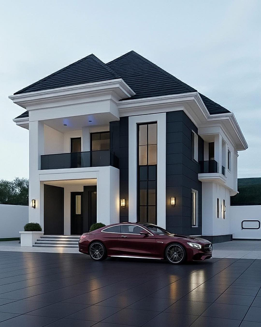
Two-tone exteriors split the visual weight so neither color has to carry the whole house. White above with dark below grounds the house and draws the eye to the roofline; the reverse would feel top-heavy.
I would keep the darker color to a smaller share of the total surface, and use it where you want to recede, foundation and lower story if the house sits high on the lot.

Extremely durable outdoor paint ideal for use on properly prepared exterior wood, brick, masonry, concrete, weathered aluminum, weathered vinyl siding*, and primed metal substrates

Extremely durable outdoor paint ideal for use on properly prepared exterior wood, brick, masonry, concrete, weathered aluminum, weathered vinyl siding*, and primed metal substrates

Suitable for interior/exterior metal or wood surfaces such as doors and shutters
6. Classic White
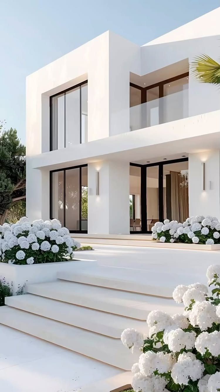
Classic white survives every trend because it is the least assuming choice you can make, and the right trim and materials keep it from looking like a default.
The black window frames give it a drawn line, the stone steps add texture without a second color, and the hydrangeas soften what could read as severe.
I would budget for good trim paint in a different sheen than the siding, because white on white needs that subtle separation or it goes blank.
Flat or matte on the walls, satin on the trim, and I would spend the extra on the windows because they are what people notice first.

Painting King design in a vintage royal yellow gold font. This hilariously funny & sarcastic graphic graphic makes a great Christmas, Birthday, or Family Holiday party dank meme gift idea for Moms, Dads, Grandparents, Brothers, Sisters & Friends.

Includes 30 featured and newest released color card. Sprayed on color to see our colors in your homes lighting for more accurate color choices.

ACRYLIC PAINT & PRIMER (2 in 1) – PRO matte black paint with 35%+ high-performance binder delivers strong adhesion, smooth coverage and a rich charcoal-black, low-sheen finish on properly prepared surfaces.
7. Bold Colors for Doors and Trim
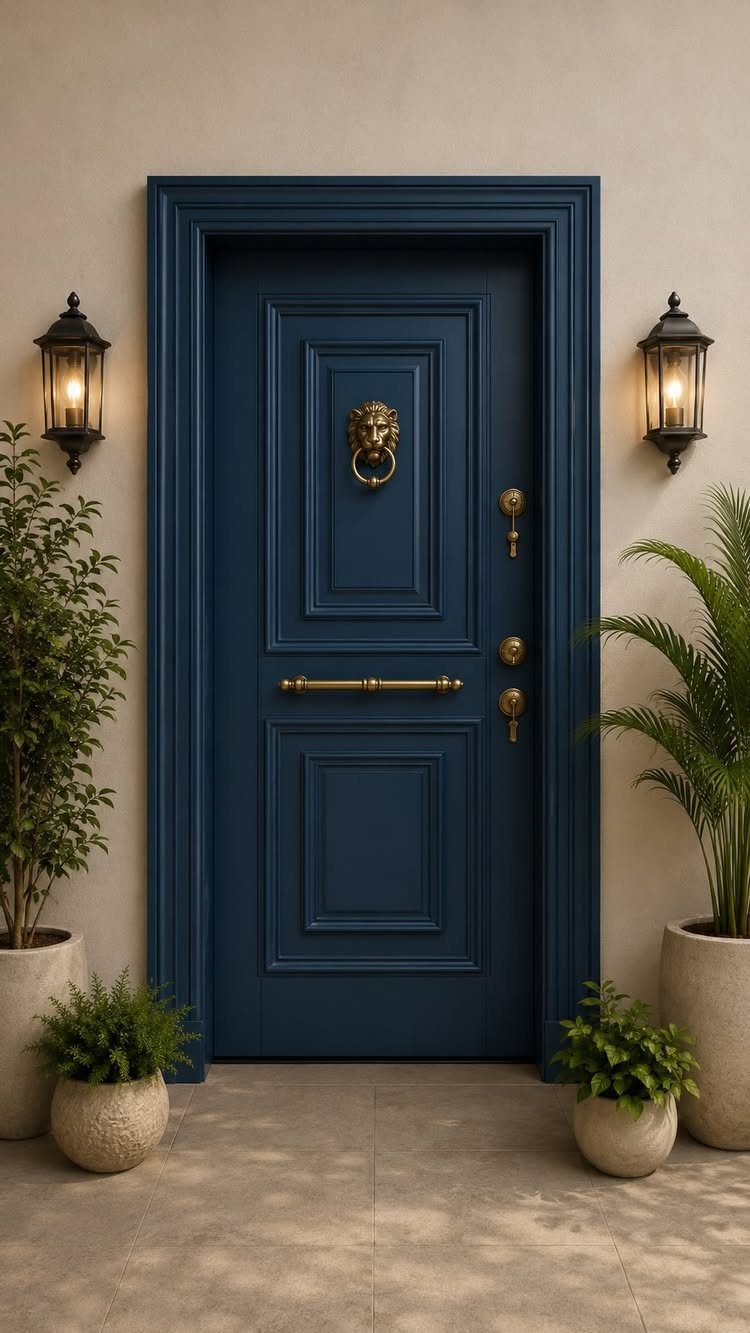
A navy door with matching trim turns the entry into the whole color story, which saves money on siding but demands confidence in the shade.
Brass hardware against that blue reads intentional, not accidental; I would spend the budget there before widening the accent elsewhere.
The lanterns need to agree with the metal, so pick one finish and carry it through. This works best when the surrounding walls stay quiet, beige or gray, so the door does the talking.
I would test the blue in morning shade and afternoon sun; a color this saturated shifts more than a neutral, and the trim means you are buying twice the area.

Made in United States

The highest sheen of any metallic paint

SPRAY PAINT AND PRIMER – Krylon COLORmaxx Spray Paint and Primer delivers premium coverage and superior color with adhesion and durability. This primer and spray paint can be used on wood, metal, wicker, most plastics, glass, plaster/ceramic and more.
8. Earthy Red Siding
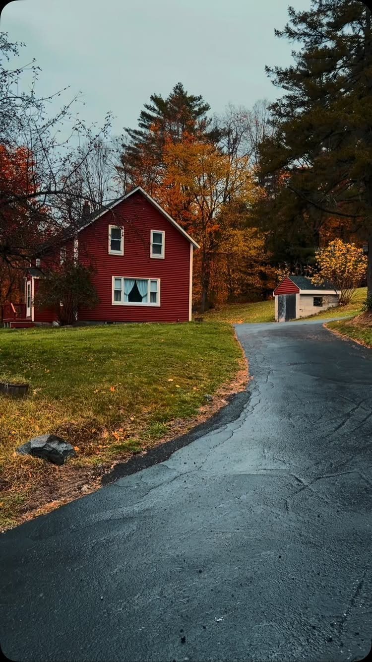
Red siding makes its best case in fall, when the trees echo it rather than competing, but the white trim does the real work keeping it grounded.
Without that crisp edge, red can read barn rather than house. I would check the roof color before committing; gray or black slate suits it, brown shingles fight it.
This color shows dirt faster than a mid-tone, so budget for pressure washing every couple of years or plan on the weathered look.
Horizontal boards keep earthy red from reading like a commercial building; vertical siding in this color rarely works on a house.

Perfect for use on farm or industrial equipment such as tractors, trailers, lawn mowers and other implements

ALL-IN-1 PAINT & PRIMER: A hardy multi-purpose and multi-surface one-coat paint and primer in one for almost any indoor or outdoor surface. A wall, ceiling, floor, skirting board, cabinet, furniture and door paint for your bathroom, kitchen, home and garden.

HIGH-TRAFFIC DURABILITY: Engineered to withstand heavy foot traffic, daily use, and repeated cleaning. This heavy-duty formula is ideal for porches, patios, basements, steps, and walkways where long-term wear resistance is required.
9. Blue with White Trim
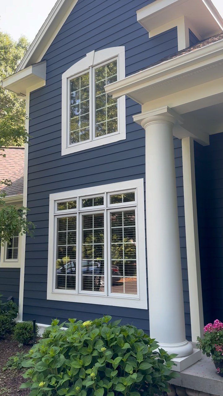
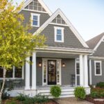
Blue siding with white trim is familiar enough that the shade of blue decides whether it reads coastal, traditional, or trying too hard.
A white porch column gives blue something to land on; without that architectural weight, the color can feel untethered.
I would sample two or three blues on the wall that faces the street, because this combination lives or dies on the exact value.
Too bright and it looks like a pool house, too gray and you lose the point. The green bushes at the foundation help; plan landscaping that continues that dark base or the house looks lifted.
ALL-IN-1 PAINT & PRIMER: A hardy multi-purpose and multi-surface one-coat paint and primer in one for almost any indoor or outdoor surface. A wall, ceiling, floor, skirting board, cabinet, furniture and door paint for your bathroom, kitchen, home and garden.

ALL-IN-1 PAINT & PRIMER: A hardy multi-purpose and multi-surface one-coat paint and primer in one for almost any indoor or outdoor surface. A wall, ceiling, floor, skirting board, cabinet, furniture and door paint for your bathroom, kitchen, home and garden.

VERSATILE SIZE - This acrylic paint comes in a convenient 2 oz bottle and is sure to be a staple in your craft supplies
10. Cream or Light Beige

Cream siding warms up in afternoon light more than a cool white would, which matters on a facade that spends its morning in shadow.
I would spend on the trim paint here, because bright white against cream is what makes it look deliberate.
The arched door is doing work too; if your entry is flat, add depth with a thicker surround or the house can look like a single plane.


ENAMEL FLOOR PAINT: Provide your floors with an extremely durable and long-lasting finish using California Paint ALLFLOR Porch, Patio and Floor Enamel Paint.
11. Taupe Siding with White Accents
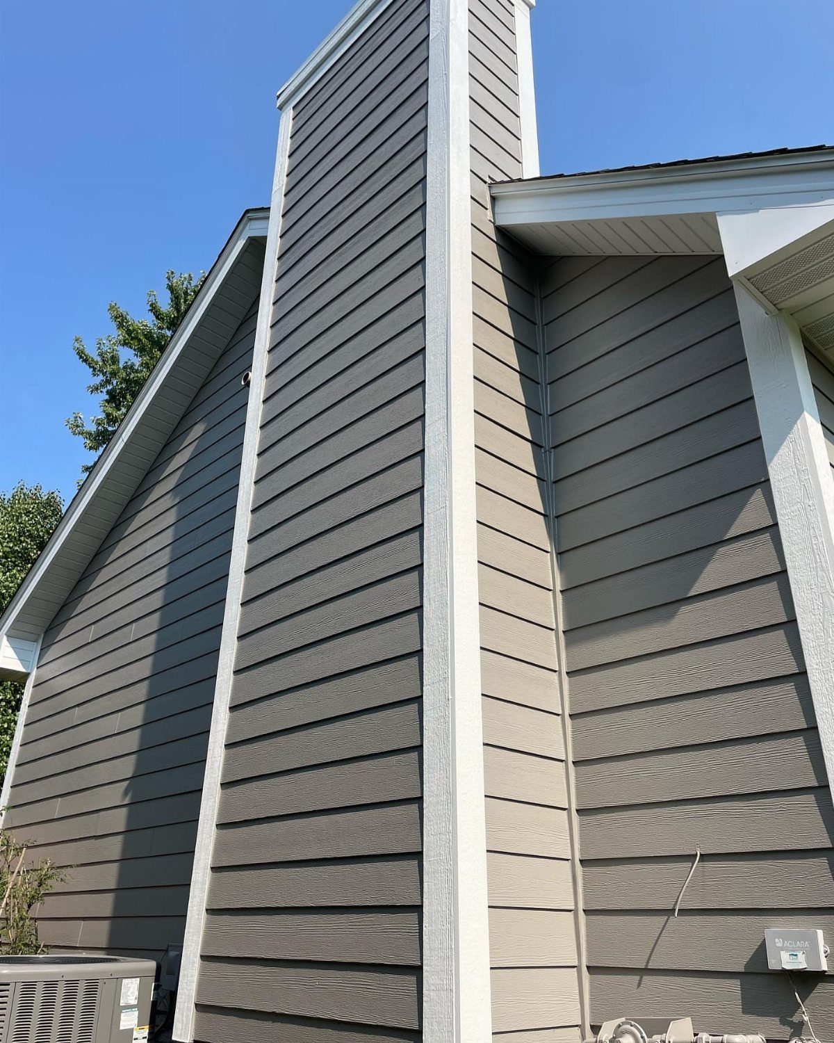
Taupe with white trim is the quietest combination here, which suits a house where stone or brick is meant to lead.
Corner trim does structural work for taupe; without those breaks, the color goes flat and the eye has nowhere to rest.
I would check the undertone against your roof, because taupe that pulls purple fights gray shingles, and taupe that pulls green needs landscaping to match.
This is the color to choose when you want the architecture to read before the paint does.
12. Warm Tan with Dark Shutters
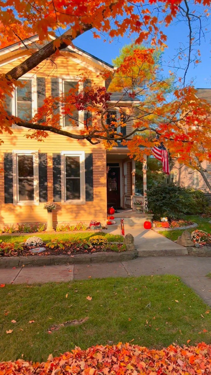
Tan siding with black shutters is the traditional pairing that still works because the shutters are actually doing something, breaking up a long facade and darkening the windows so they read as openings.
The fall setting flatters it; in summer, I would make sure the landscaping has enough depth or the tan can look parched.
A third color, even a small one like a flag, keeps warm tan and dark shutters from feeling too staged and deliberate.
I would budget for real wood shutters over vinyl; the depth of shadow matters here, and flat panels read as appliqué rather than architecture.
Testing Paint Colors
Exterior light is harsher and more changeable than anything indoors; sun angle, shadow, and the green reflection from your lawn will all shift the color.
I tape swatches to the siding and check them at 8 AM, noon, and 6 PM, then walk to the curb where the mail carrier stands; the color that looked soft in shade can turn chalky or heavy in direct sun, and distance changes everything.
The 9 x 14.75 inch peel-and-stick samples from Samplize are large enough for this, and they spare you the mess of brushing out wet paint.
If you are sampling a color that sits near gray or greige, pay attention to which direction it shifts at dusk; that is the version of the color you will live with most of the day.
Sage gray/greens are one of the most popular exterior paint colors for 2025, with Anonymous by Sherwin Williams being a standout example.
Cohesive Color Schemes
Start with what you cannot change. Roof shingles, stone, brick, concrete, and window frames all carry undertones that your paint either matches or fights.
Warm fixed finishes, browns, tans, golden stone, need warm whites, greiges, and taupes. Cool fixed finishes, charcoal roofs, gray stone, black windows, want cool whites, modern grays, and deeper charcoals.
2 colors can look perfect on paper and still fight once they’re on the house; the clash almost always comes from the undertone, not the hue you named on the chip.
For a house with natural wood or stone finishes, a calm earthy pairing like warm beige with soft white keeps the exterior connected to its setting rather than sitting on top of it.
I would hold paint chips against the roof and the largest stone or brick area in direct sun before deciding; the eye adjusts to what is familiar, and a second look after coffee helps.
Front Door Colors
A front door is the one place on the exterior where a saturated color makes sense, because it is small enough to read as an accent rather than a commitment.
For 2025 I’m seeing less of the high-gloss reds and teals that announce themselves three blocks away; a stained walnut door or a deep olive-black that picks up your interior flooring reads as invitation, not announcement.
Yellow still works if you want the door to feel like an invitation; a warm sunshine shade against bright white trim gives the surround enough contrast to feel deliberate.
I would choose the door color after the siding and trim are settled, not before, since it has to agree with both.
For materials, FSC-certified wood and energy-efficient entry doors are worth the search; they regulate temperature better and the insulation shows up in utility savings.
Frequently Asked Questions
What are the latest color trends for exterior paint?
Warm neutrals and dark, dramatic hues have been leading exterior paint trends for a couple of years now.
Cool grays and high-contrast pairings are giving way to softer, earthier palettes: creamy off-whites, warm beiges, and muted sand tones that read natural in daylight.
Darker shades like charcoal and deep olive-black are reading as architecture rather than paint, especially when paired with natural wood accents.
What are the colors not to paint your front door?
High-gloss reds and teals are losing ground; from the sidewalk they read as a shout instead of a welcome.
A saturated color works on a door because the area is small enough to read as accent, but the shade still needs to agree with your siding and trim.
I would skip anything that fights both the wall color and the metal finish on your lanterns and hardware.
What are the main house color trends for 2026?
The 2025 direction points toward softer, more muted palettes and away from high-contrast two-tone exteriors and stark farmhouse whites.
Reclaimed wood and stone features are replacing board-and-batten rustic looks. This suggests 2026 will continue the shift toward natural, inviting aesthetics with less cold contrast between elements.
What color makes a house look expensive?
Neutral colors that let the architecture read before the paint does tend to convey the most elegance.
Taupe with white trim, warm tan with real wood shutters, or a quiet cream with bright white trim all signal intention rather than default.
The expense shows in the details: contrast between sheens, trim that does structural work, and materials like brass or stained wood that catch light.