Victorian exteriors run from quiet tan-and-black schemes to three-tone palettes with teal siding and salmon trim.
The right scheme depends on how dense your trim is: modest millwork stays readable with 3 colors, but ornate gingerbread needs them or the detail collapses into noise.
1. Three-Tone Victorian House Colors Exterior

Three-tone schemes let you separate body, trim, and accent without fighting for attention.
Mint siding and cream gingerbread read as two-tone until a third color hits the sashes and rails; dark brown there is what keeps the scheme intentional rather than afterthought.
Check your trim density before you commit. A Victorian with modest millwork can handle three colors, but an ornate one needs them or the detail turns to noise.
I would test the darkest tone on the windows first; if it shrinks them visually, shift it to the porch railings and keep the sashes mid-tone.

Ready to use, pre-mixed door and trim paint offers a fresh new look on interior or exterior metal, wood and fiberglass

✅ Three pre-filled precision applicators are included for completing multiple touch-ups, small repairs, or ongoing projects without reloading or cleanup.

✅ Three pre-filled precision applicators are included for completing multiple touch-ups, small repairs, or ongoing projects without reloading or cleanup.
2. Monochrome with Texture
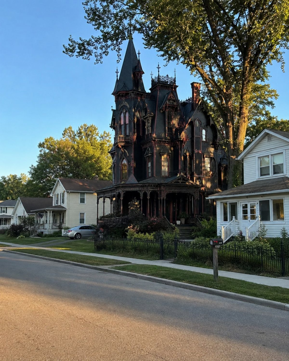
A single dark color across clapboard, scalloped shingles, and carved brackets builds depth through shadow instead of contrast. Almost-black reads flat until fretwork layers catch the light and break the surface into shadow.
This suits Victorians with varied textures and a quiet street presence.
I would skip it on a flat-sided house; without the relief, you get a box, not a scheme. Check your wood condition too: one color exposes every repair patch, so budget for thorough prep or expect to see the work.

Authentic 1:12 Scale Details Includes 40 miniature decorative brackets in 4 Victorian-inspired designs; each bracket measures 2 x 2 in (51 x 51 mm) and is sized for 1:12 scale dollhouses, room boxes, and architectural models

Used Book in Good Condition

Authentic 1:12 Scale Details Includes 40 miniature decorative brackets in 4 Victorian-inspired designs; each bracket measures 2 x 2 in (51 x 51 mm) and is sized for 1:12 scale dollhouses, room boxes, and architectural models
3. Pastel Pink and White

Pink siding with white trim is the choice that announces itself before you reach the walk. The photo keeps it in control by limiting the pink to the clapboard and letting the porch fretwork, fence, and awning carry the white.
I like this for a cottage-scale Victorian or one with a generous setback; up close on a tall narrow lot, it can feel like a confection.
Test the pink in morning and evening light before you buy; the warm undertones that read soft at noon turn peachy fast.
A sample board on the north side through a full day and night tells you what you are living with.


Used Book in Good Condition

CONVENIENT SIZE - This outdoor acrylic paint set includes 16 - .1667 fl oz paint pots as well one brush. The colors in this paint set include: Delta Outdoor Royal Blue, Sky Blue, Light Blue, Pink, Purple, Terra Cotta, Brown, Black, Dark Green, Light Green, Turquoise, Magenta, Light Brown, Red, Yellow and White
4. Lavender and Mauve with White
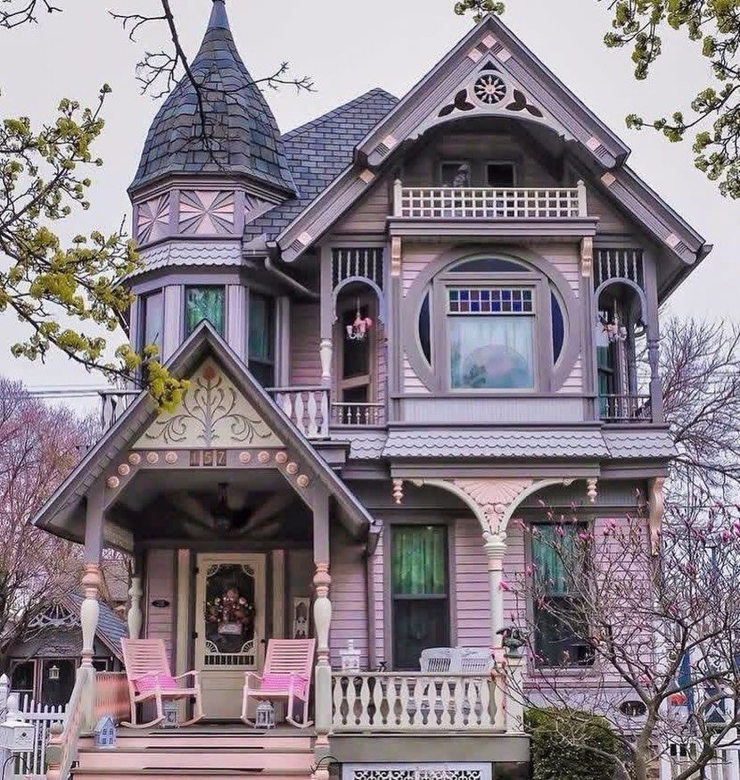
Lavender body, mauve shadow lines, and cream trim give a purple Victorian the layering it needs to avoid looking like a single wash.
Two purples separate round tower from flat wall; the darker shade follows the turret’s curve while the lighter one stays on the flat planes.
I would use this where the gingerbread is dense enough to carry the cream; sparse trim leaves too much lavender floating. Check your roof color too.
A grey or slate roof bridges the tones; red or orange roofing fights them. If your shingles are warm, I would shift the body to greyed mauve and keep the lavender for the porch ceiling only.

Vinyl Siding Edge Finish: this vinyl siding j channel receives panel ends and hides rough cuts around openings, giving exterior walls a tucked, coordinated look while...
5. Classic White with Dark Green

White clapboard with dark grey mansard roofs and a green glass conservatory is the formal end of Victorian color.
Dark green anchors the garden side where planting meets foundation; white keeps the mass readable from the street so the house does not sink into shadow.
This is the scheme I would pick for a house with mixed additions or an awkward roofline; the white unifies, the dark roof recedes, and the green draws the eye to the feature you want seen.
Premium white paint earns its price on this scale; cheap white chalks fast, and the touch-up shows across every broad plane.

VERSATILE SIZE - This unique chalk acrylic paint comes in a convenient 8 oz size and has a rich, highly pigmented formula - perfect for all your home décor projects

CONVENIENT SIZE - This Apple Barrel Acrylic Paint comes in a versatile 2 oz size that is great for basecoating, stenciling, and so much more

Used Book in Good Condition
6. Deep Blue with White Trim
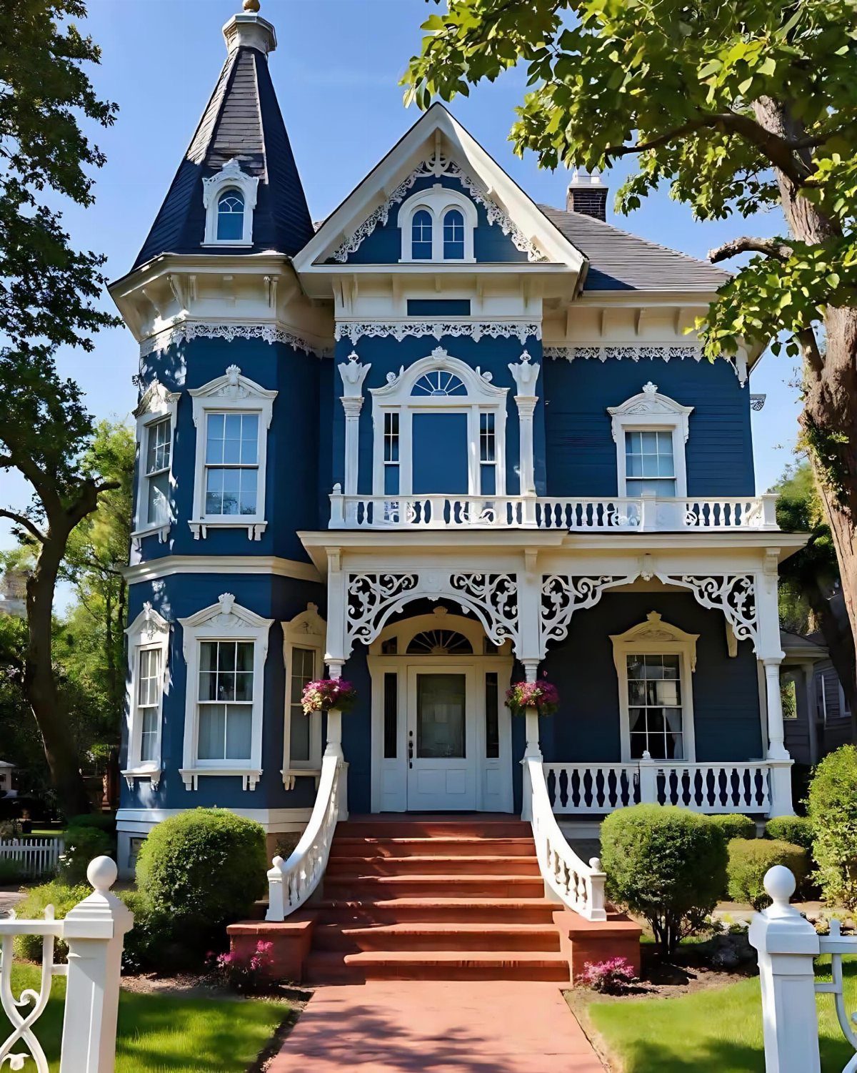
Deep blue with white trim is the navy blazer of Victorian schemes: it works on almost every house type and reads correct in almost any neighborhood.
White on the porch railings, gable brackets, and window surrounds frames the blue that carries the body and the turret.
I would use a true navy with slight grey in it, not a bright marine blue; the latter competes with the white instead of setting it off.
For the trim, match your white to the porch ceiling: a warm white keeps the scheme historic, a stark white turns it coastal. Test both together, not on separate boards.

✅ Three pre-filled precision applicators are included for completing multiple touch-ups, small repairs, or ongoing projects without reloading or cleanup.

Great for wood siding, trim, decks, fences, and interiors

Great for wood siding, trim, decks, fences, and interiors
7. Teal or Slate with Salmon
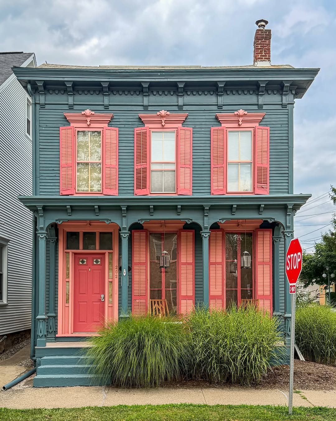
Slate blue body with salmon shutters and door trim is the Victorian scheme that reads modern without losing period texture. The photo keeps the salmon to operable parts: shutters, door, and thin porch rails, not the gingerbread itself.
I would check the salmon’s undertone against your brick or stone walk before committing.
A coral salmon turns orange in afternoon light; a pink salmon stays truer. On a house with little trim, this two-color approach still works because the door and shutters give you enough salmon to register.
I would skip it if your windows have no shutters; without that rectangle of color, the scheme goes lopsided.

Used Book in Good Condition


Decorative trim for 1:12 scale dollhouses: Designed for miniature Victorian-style houses, roomboxes, dioramas and architectural projects; use it as running trim for porches, rooflines, walls, windows, room dividers and miniature furniture
8. Tan Siding with Black Trim
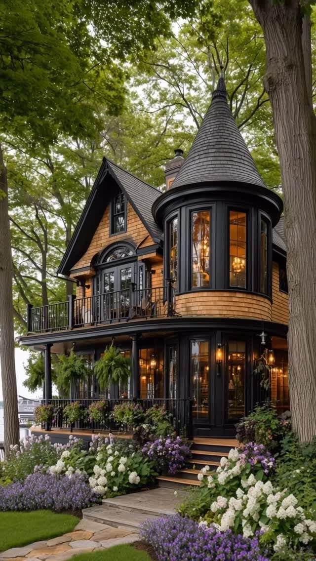
Tan siding with black trim is the quietest scheme on this list, and the one that lets planting do the color work.
The black reads as shadow on the turret and balcony railings, so the house shape stays clear without bright contrast.
This suits a Victorian with good lines and a garden that performs year-round. I would use it where the lot is deep and green; on a bare yard or winter-dominant climate, the tan can read as unfinished.
Check your wood grain too: tan stain lets it show, tan paint hides it, and black trim against painted tan looks harder than against stained. Sample both finishes before you order.
Color Selection Tips
A sample board on the north side through a full day and night tells you what you are living with, which I would do before committing to anything on the actual siding.
The north side sees no direct sun; morning light warms everything; late sun flattens color into shadow.
I never match paint across brands.
A painter may swear it works, but sheens differ and the color shifts. Buy the brand you will apply.
Deep jewel tones, greens, burgundies, navy, read striking without tipping into gaudy, especially where bolder houses already sit on the street.
They hide dirt and photograph well. A simplified palette can emphasize architectural detail rather than fighting it; too many colors on ornate trim turns the whole facade to noise.

Ready to use, pre-mixed door and trim paint offers a fresh new look on interior or exterior metal, wood and fiberglass

25 VIBRANT COLORS: Shuttle Art outdoor acrylic paint set includes 25 high quality outdoor acrylic paints: 20 classic colors, 3 glow in the dark shades, and 2 metallic finishes, each in 60 ml/2 oz bottles. It also comes with 10 paint brushes, a mixing palette, a mini UV light, a color wheel, and an instructional guide, providing everything you need for endless creative possibilities

12 OUTDOOR BULK PAINT: Shuttle Art outdoor acrylic paint set includes 12 vibrant colors, each in a large 8.45 oz/250 ml bottle. The paint set also comes with a painting knife, sponge, and color wheel, offering essential tools to enhance your creative process. Ideal for artists, beginners, kids, and adults working on handcraft projects
Maintenance Considerations
Lighter colors show dirt faster; darker colors fade in sun. That trade-off is fixed, so pick based on what bothers you more, and what your climate delivers.
Dark trim on shadowed porches stays truer longer but can heat the wood enough to check the finish. Budget for thorough prep either way; one color across a whole house exposes every patch and repair.
I would plan on washing light colors twice yearly, and expect to repaint dark ones a season sooner than the can promises.

Great for wood siding, trim, decks, fences, and interiors

PURDY PRO-EXTRA PAINT BRUSHES - Purdy Pro-Extra paint brushes hold more paint so you can get the job done faster. These paint applicators are a favorite of the pros!

PAINT & PRIMER-IN-ONE: Cascadia ZERO is an Ultra-Low VOC, Acrylic Blend Paint & Primer-in-One; save time with less coats
Historical Color Resources
Local archives and historical societies hold the original color records for many Victorian houses.
The palettes are often more vivid than expected; earth pigments, Naples yellow, ochre, raw sienna, Terre Verte, raw and burnt umber, lapis lazuli, vermilion, grounded the choices of the period.
High-chroma modern colors read artificial against that history. If authenticity matters, specialist paint and careful prep are necessary, but the result harmonizes with the architecture in a way factory-mixed brights do not.
I would start with the historical sample, then test it against your actual light and your actual trim density. A period color on a stripped-down Victorian can look pasted on; the same color where gingerbread is dense reads as belonging.
French Grey is the go-to colour where a warm and neutral backdrop for decoration is required. Many other shades from the Victorian period have found favour too, including Portland Stone, Bath Stone and Ashes of Roses.
Frequently Asked Questions
What color were houses painted in the 1800s?
Victorian builders reached for earth pigments because they were cheap, plentiful, and stayed true for years without fading: ochre, raw sienna, burnt umber, Terre Verte, and the occasional touch of vermilion or lapis lazuli for accent.
A slow hand with the mixing stick turned trade colors into richer greens and browns; a little black or umber went a long way, and the patience paid back in finishes that held up season after season.
What makes a house considered Victorian?
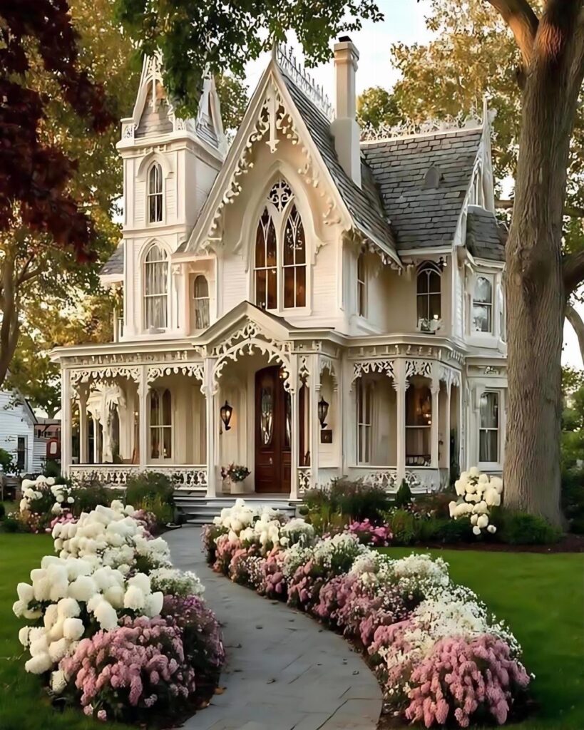
A Victorian house is defined by its ornate millwork, varied textures like clapboard and scalloped shingles, and complex rooflines with features such as turrets, gables, and gingerbread trim.
The architecture demands a color scheme that either separates or unifies that density, depending on how much detail is present.
What are some popular color schemes for Victorian houses?
Three-tone schemes that separate body, trim, and accent are the standard starting point.
Pastel pink and white, lavender and mauve with cream, classic white with dark green, deep blue with white trim, teal or slate with salmon, and tan with black trim all appear regularly.
Each suits a different house scale, trim density, and street setting.